Texas Monthly Subscription Checkout
Texas Monthly reports on vital issues from politics to education and is the authority on the Texas scene.
The Challenge
For almost half a century, Texas Monthly has chronicled life in the Lone Star State, exploring its politics and personalities, barbecue and business, true crime and tacos, honky-tonks and hiking. Unfortunately, the process of subscribing to the magazine was confusing and overly complicated, resulting in a diminished experience for prospective subscribers and a significantly adverse effect on subscription revenue.
Existing User Flows
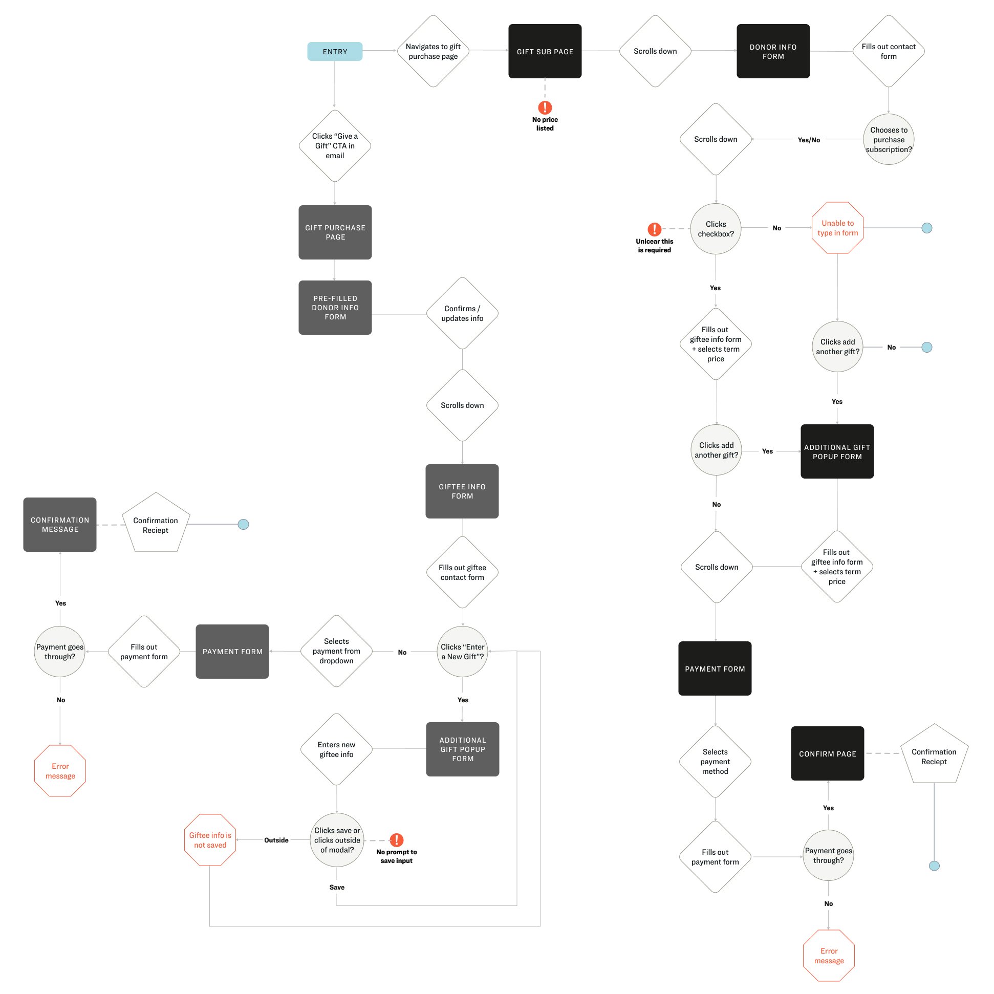
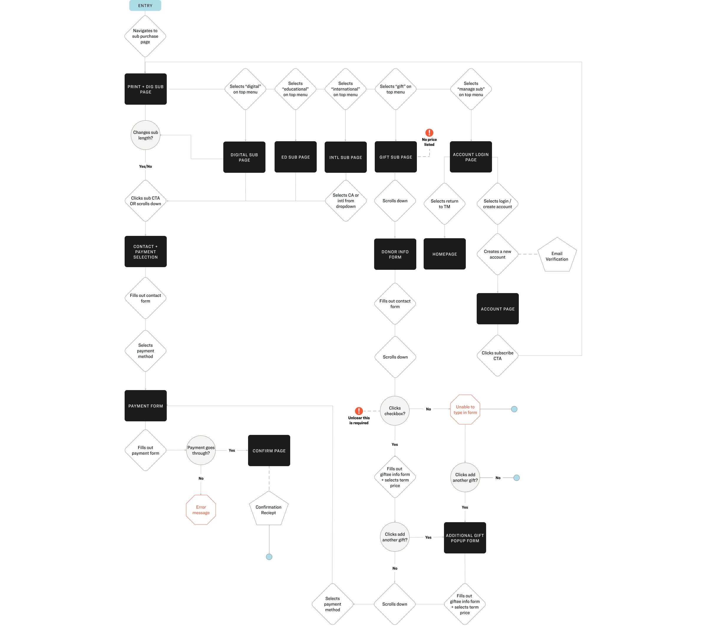
To begin, I conducted a comprehensive evaluation of the existing checkout process and account creation for new subscribers, renewals, and gifts, where I reviewed the interface and compared it against accepted usability principles. I came across a number of pain points during my evaluation (outlined below) which needed to be addressed regardless of the visual design direction.

Research & Stakeholders
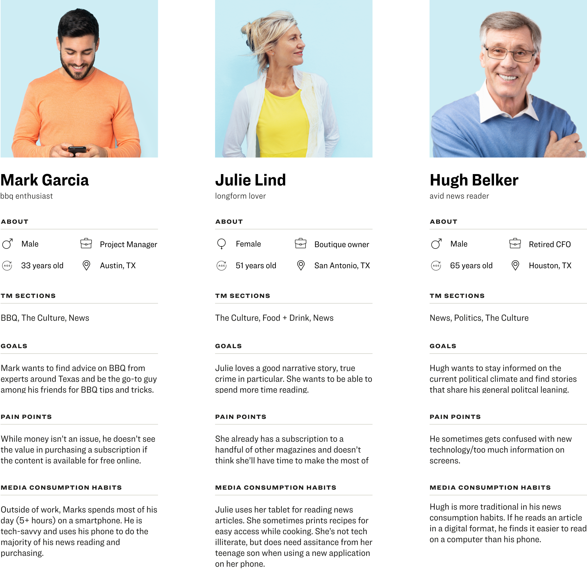
Once I had a firm grasp of the existing purchase process, I conducted a competitive analysis to understand the common trends of checkout experiences other publishers utilize. I also held interviews with stakeholders (primarily Customer Service Representatives) who speak to subscribers on an ongoing basis and could provide examples of the problems they are facing with the current process. With user research provided by our data analyst, I created the following user personas.
Wireframes
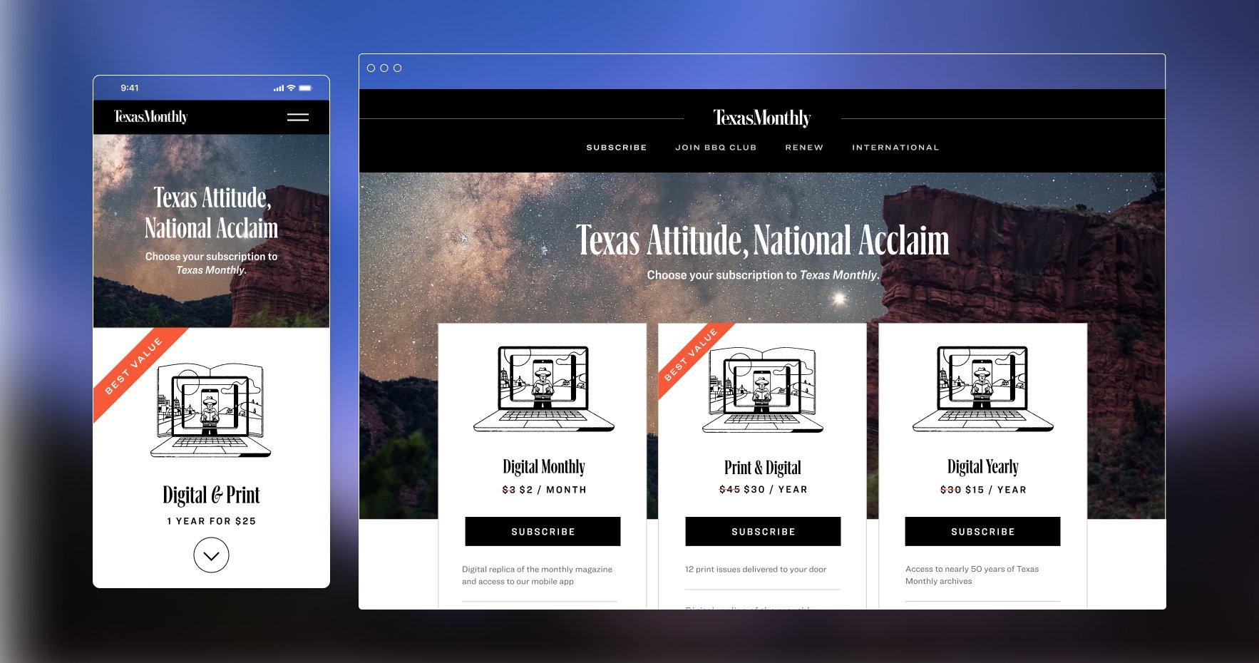
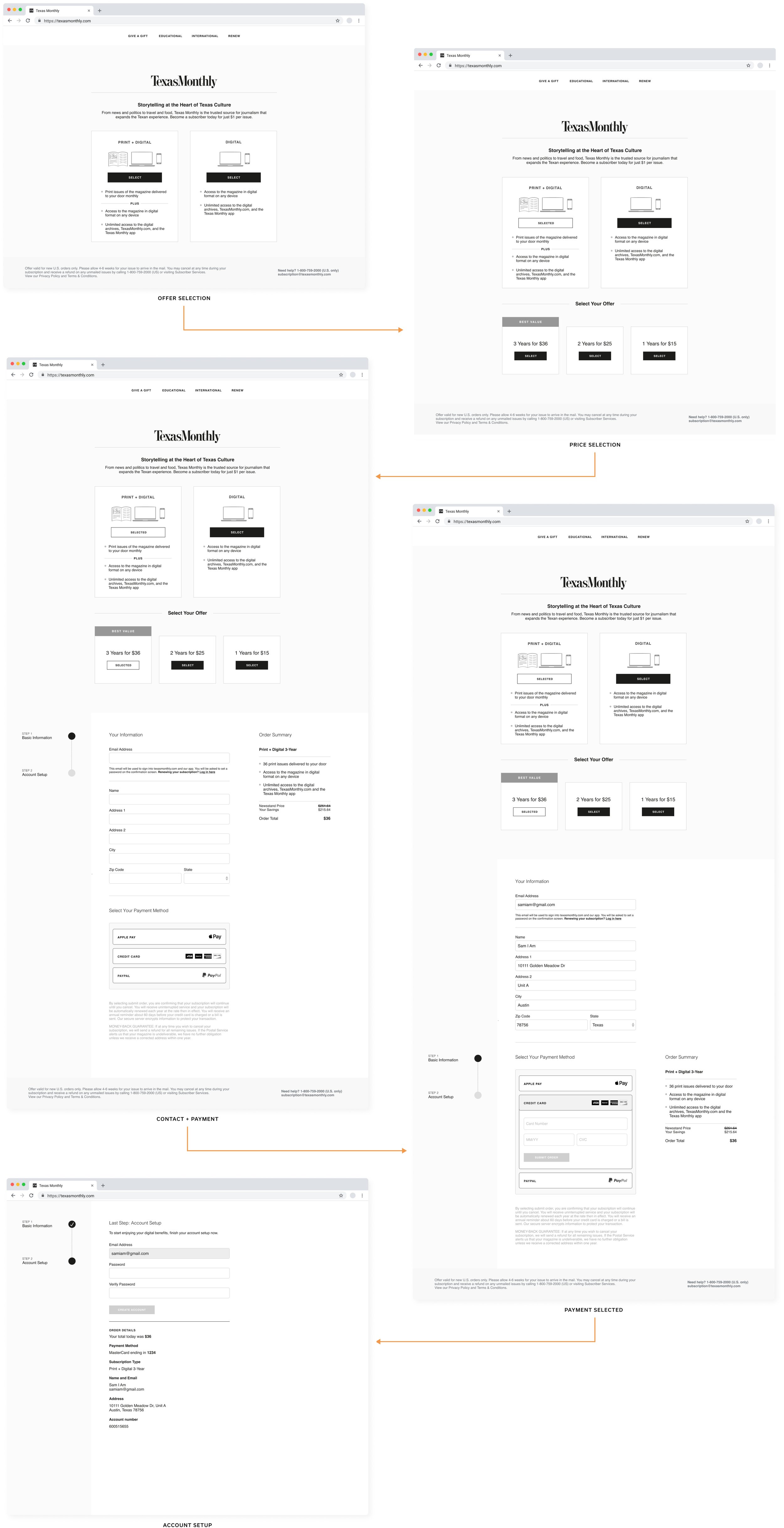
Instead of using separate pages for the primary subscription offers, I opted for presenting them on a single page. For alternative subscription types (gift, international, academic), I included simple nav links at the top of the page.
I also created an express checkout option presented to the user immediately upon selecting their subscription term.
An important pain point of the original checkout process was account creation, and the inability to set a password within the purchase flow. This created friction for the user and resulted in a large number of support requests. To solve this, I included a password creation step upon purchase completion, ensuring that the user has immediate access to the digital content.

Look & Feel
Once the UX deliverables were complete, I delivered a project brief, style guide, and artifacts to Funsize, a UX design firm we contracted to craft the initial visual designs.


Initial Visual Designs
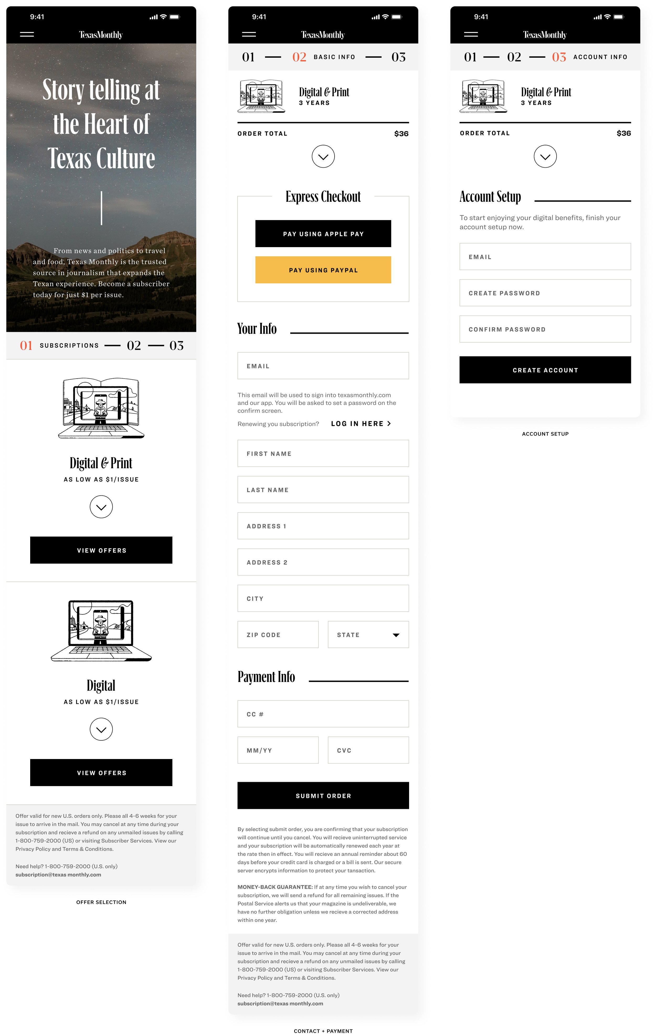
Once Funsize provided design files, the first iteration of the new checkout was released in October 2020.

Final Visual Designs
In December 2020, we released an updated design in order to test the impact imagery, layout, and pricing would have on conversion rates.


